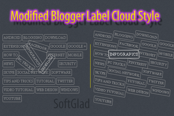
I'm so pleasure today because i'm bringing to you a Awesome Modified Blogger Label Cloud Style widget. This one is my hard work tutorial, last one week i'm maintaining this. The specialty of this tutorial is four different styles here which you can create your blog label cloud awesome look.
What is Label in blogger ?
Label (Categories) are keywords that categorizes your complete blog content. Labels are mostly based on general and specific keywords of your content. It allow the designers to create their own style. Since the stylesheet was made approachable, thereby all of us got a chance to play with these widgets and transform them to different in look and appearance.
Here i'm going to give you four different style which you can modify your Label Cloud, and warning that you must have added label cloud widget to your blogger blog.
Here i'm going to give you four different style which you can modify your Label Cloud, and warning that you must have added label cloud widget to your blogger blog.
How To Add Label Cloud Widget In BLogger
1. Go to Blogger > Layout > Add a Gadget > and click Label.
2. Click Mark some property shown below and Save it.

How To Add CSS Code to Blogger
Now is the time for making awesome look of you blogger label cloud widget. So add one of the following style to your blog.
1. Go to Blogger > Template > Click Edit HTML.
2. Find ]]></b:skin> ( by Ctrl+F) and add one of the following style before it.
Label Style #1

1
2
3
4
5
6
7
8
9
10
11
12
13
14
15
16
17
18
19
20
21
22
| .label-size a {text-transform: uppercase;float: left;text-decoration: none;margin: 0 3px 6px 0;padding: 3px;border: solid 1px #999;border-radius: 3px;font-size: 12px;-moz-transition: all 0.3s ease-out;-o-transition: all 0.3s ease-out;-webkit-transition: all 0.3s ease-out;-ms-transition: all 0.3s ease-out;transition: all 0.3s ease-out;}.label-size a:hover {border: 1px solid black;-webkit-transform: rotate(360deg) scale(1) skew(1deg) translate(0px);-moz-transform: rotate(360deg) scale(1) skew(1deg) translate(0px);-ms-transform: rotate(360deg) scale(1) skew(1deg) translate(0px);-o-transform: rotate(360deg) scale(1) skew(1deg) translate(0px);} |
Label Style #2

1
2
3
4
5
6
7
8
9
10
11
12
13
14
15
16
17
18
19
20
21
22
23
24
25
26
| .label-size a {text-transform: uppercase;float: left;text-decoration: none;margin: 2px 3px 6px 0;padding: 3px;border: solid 1px #999;border-radius: 3px;font-size: 12px;-moz-transition: all 0.3s ease-out;-o-transition: all 0.3s ease-out;-webkit-transition: all 0.3s ease-out;-ms-transition: all 0.3s ease-out;transition: all 0.3s ease-out;-webkit-transform: rotate(10deg) scale(1) skew(5deg) translate(0px);-moz-transform: rotate(10deg) scale(1) skew(5deg) translate(0px);-ms-transform: rotate(10deg) scale(1) skew(5deg) translate(0px);-o-transform: rotate(10deg) scale(1) skew(5deg) translate(0px);}.label-size a:hover {border: 1px solid black;-webkit-transform: rotate(0deg) scale(1.2) skew(5deg) translate(0px);-moz-transform: rotate(0deg) scale(1.2) skew(5deg) translate(0px);-ms-transform: rotate(0deg) scale(1.2) skew(5deg) translate(0px);-o-transform: rotate(0deg) scale(1.2) skew(5deg) translate(0px);} |
Label Style #3

1
2
3
4
5
6
7
8
9
10
11
12
13
14
15
16
17
18
19
20
21
22
| .label-size a {text-transform: uppercase;float: left;text-decoration: none;margin: 2px 3px 6px 0;padding: 3px;border: solid 1px #999;border-radius: 3px;font-size: 12px;-moz-transition: all 0.3s ease-out;-o-transition: all 0.3s ease-out;-webkit-transition: all 0.3s ease-out;-ms-transition: all 0.3s ease-out;transition: all 0.3s ease-out;}.label-size a:hover {border: 1px solid black;-webkit-transform: rotate(0deg) scale(1.2) skew(5deg) translate(0px);-moz-transform: rotate(0deg) scale(1.2) skew(5deg) translate(0px);-ms-transform: rotate(0deg) scale(1.2) skew(5deg) translate(0px);-o-transform: rotate(0deg) scale(1.2) skew(5deg) translate(0px);} |
Label Style #4

1
2
3
4
5
6
7
8
9
10
11
12
13
14
15
16
17
18
19
20
21
22
23
24
25
26
| .label-size a {text-transform: uppercase;float: left;text-decoration: none;margin: 2px 3px 6px 0;padding: 3px;border: solid 1px #999;border-radius: 3px;font-size: 12px;-moz-transition: all 0.3s ease-out;-o-transition: all 0.3s ease-out;-webkit-transition: all 0.3s ease-out;-ms-transition: all 0.3s ease-out;transition: all 0.3s ease-out;-webkit-transform:rotate(0deg) scale(1) skew(-15deg) translate(0px);-moz-transform: rotate(0deg) scale(1) skew(-15deg) translate(0px);-ms-transform: rotate(0deg) scale(1) skew(-15deg) translate(0px);-o-transform: rotate(0deg) scale(1) skew(-15deg) translate(0px);}.label-size a:hover {border: 1px solid black;-webkit-transform: rotate(0deg) scale(1) skew(15deg) translate(0px);-moz-transform: rotate(0deg) scale(1) skew(15deg) translate(0px);-ms-transform: rotate(0deg) scale(1) skew(15deg) translate(0px);-o-transform: rotate(0deg) scale(1) skew(15deg) translate(0px);} |
If you have got any trouble regarding this tutorial, you can comment it below.